We just rolled out a whole raft of improvements and tweaks that are built to make Technorati easier to use and easier to understand. A few things that we rolled out:
1) Charts. Get live, updated charts on what people are saying about stuff you care about, like this, which shows a chart of the mentions of "King Kong":
2) Improved extracts. We've worked hard to make the information in the extract that we present to you much more understandable, so that you'll be able to make a better choice before clicking through to get to the source post. Here's an extract from a vanity search:
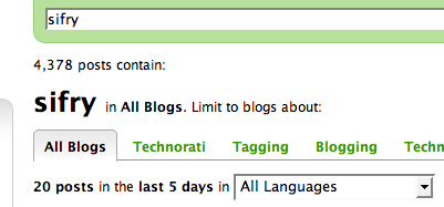
3) Scoped Search based on related tags. You can now scope a search to better understand what a community of people are saying about a subject, all in a tabbed format right below the search box, as shown below:
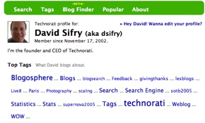
4) Enhanced profile information. We've put up more information about your blogs, and if you're a tag user, you can even get a map of the most popular tags you use in your blog posts. Simply click on the Author's name in search results, and you'll get taken to his or her profile page. Here's mine, along with a snippet of the tag cloud:
5) Lots more. Including a new Blog Finder widget to help you find out who is blogging about the topics that you're interested in (don't forget to claim your blog and add your tags, including your name!), revisions to the Popular widget, and a new tag widget, all down the left-hand side of search results, and lots of other tweaks.
These changes came after weeks of user feedback studies, learning by watching users and what they wanted and did on the site, and lots of tuning and tweaking of the infrastructure. We're looking for your feedback and comments on the changes! Did we do a good job? Are things easier to use? Is your favorite vanity search more understandable? Does it have more data? What else do you want?
Technorati Tags: blogosphere, blogsearch, charts, feedback, launch, profile, scaling, search, serp, tags, technorati, thanks, weblog


